Saturday, 31 October 2009

Having had some time to review my research into overhearing I have had some developments, as the next brief was looking at packaging and promoting/informing/instructing/persuading i have had to find a way to involve overhearing.
Proposal 1
One of my proposals was to produce promotional media for a coffee house. Using the idea of a coffee house as a social place of interest where people would go to eat drink and more importantly chat and talk, therefore overhearing is likely to occur, I intend to promote overhearing in a subtle advertising campaign. The campaign will comprise of a series of visuals on interior posters and decoration, articles of beverages such as cups and even sugar packets as well as a window display, the visuals will be based on quotations which can be taken from overhearings in the coffee house. This campaign will act to create a cycle, the idea being that people look and discuss the quotes, which in turn is overheard and the cycle begins.
This campaign will promote the coffee house as a good place to socialize and chat aswell as enjoy beverages and lunches and possibly help increase customer revenue. And with interesting visuals the campaign could even increase IPC where customers purchase more because of the visuals on items, this could also increase the number of customers eating in as oppose to out.
I have been looking a existing coffee houses in leeds, ideally independent coffee houses and bars as i could think about approaching one of them to see if they were interested in the project.
As for creating a visual style to this I have had a couple of ideas in mind, because the is a lot of text within my project, quotations being my main focus, the design could be quite typographical, the cover of the book "New Vintage Type" by Stephen Heller gave me great inspiration and the vintage feel would be perfect for use in a coffee house. A limited colour pallet I think would help keep print costs low and co-inside with the feel of the project and setting of a coffee house. I also intend to look at feasibility of this project, costs of printing etc.
Proposal 2
In a similar sense to the previous proposal I intend to produce packaging and promotional media for a phone. The phone being an article used to communicate and share this which inadvertently in almost always herd by someone else, typical example being on buses and again in cafes and bars. Using again the idea of quotations the promotional material would be based on the quotations that I take of people primarily on the phone and would be used to create visuals most likely in the same manner as before.
The campaign again would be used to increase customer revenue and purchases of the particular phone and customer interest towards the phone company of choice could increase.

As you could probably tell from this, my main interest is in the first proposal, being it more feasible I would like to continue my efforts into this. On wednesday I have to pitch my idea to my colleagues and tutor, hopefully they will agree. As for the research I have obtained loads of visuals to work with on the blog and in my physical work. This video below is for a Carphone Warehouse promotion by Kristopher Strom, this was one of the key visuals I looked for the phone packaging proposal. I really like the illustrative style I think these would look great next to some hand-drawn text of the quotations I've been collecting.

Monday, 19 October 2009

Some exciting use of print by MorningBreath, a creative studio which bases it practice on design for print through visualization, illustration and design. They create visuals for a variety of clients across media from music to publishing. Their work has a distinct graffiti edge with a often a use of a limited colour pallet, layers, halftones etc, the typeface initially drew me to them as it reminded me of the when we designed a typeface for a colleague, which the first years are currently doing at the moment. I thought this might give me some inspiration for the 16 page publication on print as i've thought about working with a limited colour pallet and also embossing.

Friday, 16 October 2009

Looking again at print yesterday, Justin Burns one of our temporary tutors brought in some useful examples of print. Utilising many different stocks, prink methods, inks and such, it gave us an opportunity to seek some inspiration for the 16 page publication on print and for the current project based on 'What is good?'.

Justin showed us some of the stockists of stock that he uses, regularly and on occasion, these trace examples were lovely. I was thinking about using something like tracing paper in the good project for over hearing, I thought the tracing paper would reflect the idea of overseeing, that idea of being able to see something even though it is private, hence overhearing. Plus I love tracing paper, there were even samples of trace envelopes included in the pack. From a company called Zanders. Yummy.
An example of some juicy embossing, mixed with magenta and some gold foil (i think). The idea of the piece was to look like a circuit board.
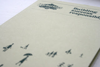
For a Warburtons promotion, a single spot colour which makes use of monotone imagery and text, I really liked the illustrative style and usage of a limited colour pallet.
A plastic piece which when layered with its card couterpart became visible, I liked the tactility of this.
Reflective stock and de-bossed text on a leaflet for a design company in Nottingham (above). (Below) I really liked this full colour publication, some tasty graph paper and a lovely crisp matte stock. I also like the printed sleeve.
Some printed text which has given a de-bossed impression on the surface of an annual report, making it that little less boring and lovely to run your nails over (above). And below a lovely logo as part of a University of Huddersfield booklet, printed in a nice metallic ink.
White on white. Mmm.

Wednesday, 14 October 2009

Having now completed the first part of the brief based on what is good, I am moving onto the second. Packaging and marketing 'What is good...' about overhearing. Whilst completing an Indesign workshop earlier I decided to have a quick look at the brief and some quick examples of innovative packaging deign that would suit the work that I am looking at, in particular I thought was audio packaging. Having obtain a large number of audio recordings I would definitely like to look at utilizing them in some way, these can then translate in text and could be used to support imagery although most of the information sources that I looked at contained very little visuals.
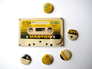
I thought these were interesting uses of packaging for badges, designed by Greig Anderson via Behance Network for a personal project. I like the utility of a mixed tape idea which somewhat related to the audio recordings I took, and i could look at translating and collecting individual quotes to display. The examples above are by a different designer Daniel Elliott for the band 'Colors' for their album 'Words will kill me', I love the visual style more than anything else the use of smell vector graphics and dotted lines and the colours on a simple white stock.
Yum.

Sunday, 11 October 2009

I thought this was lovely, for the Office of the Tooth Fairy designed by Rubber Design a record sheet for teeth that fall out. How it works is, you place the tooth in the bag provided (screen printed, 2 colour + stock) and the tooth fairy (parent) would take the tooth and give you some money in replacement and the tooth fairy keeps record of the tooth using the document and for subsequent teeth that fall out later, taking note of your age, tooth lost, method of extraction and even the compensation information. I think it is a lovely random little record and something especially for the parents (tooth fairies) to have cherish. I was really attracted by the print quality on this, letterpress printed using only 2 spot colours throughout the design. Found via Graphic Exchange.

Saturday, 10 October 2009

I think the letterpress is turning into an addiction. Luke stumbled across this lovely blog the other day whilst in the photoshop workshop and between the excitement and mouth gaping I without hesitation wrote it down. BeastPieces is a letterpress workspace in Minnisota, in the U.S., and unlike some of the other letterpress blogs I follow this one seems to have a more distinctive quailty to the work that is really engaging, utilising lots of illustration and innovative stock use. These below were wedding invitations, I love the depression on these the press makes and the type on these, so fluid it looks like it is written by hand.
These are quite inventive use of stock, business cards/invitations designed for another designer, Matt Van Ekeren. They're actually tongue depressors, echoing that idea of 'design that talks', love it.
A set of Card coasters, really like the illustrative style on these and not just the print quality.
BeastPiece's very own business card, throwing stars. Awesome.

Friday, 9 October 2009

Design for Print presentation slides.