Working with motion may be something to consider later on. This ident was also used by myself during the Design for Digital Media Module, the Su Blackwell video which I looked at in earlier posts.
Sunday, 28 February 2010
Paper in Motion: Ford Kuga, "Blank Canvas"
Looking again as design concepts I remembered this advertisement for the ford Kuga where the world became encased in paper to start again afresh. What if I could use this in some way with the federigonni showroom? Watch this space.
Sirio Calendar by Fedrigoni
To die for perhaps? Whilst searching the Fedrigoni website I came across this beautiful piece, a laser cut calendar designed by Studio 8 using none the less Federigoni paper. £25? Buy it from Blanka.
Friday, 26 February 2010
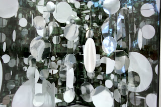
Federigoni Past Exhibiton: Fedrigoni Mountains
Looking again at Fedrigoni's history I found this gorgeous installation piece for an exhibition using the existing showrooms, how helpful and inspiring. Using this I was able to track down the beautiful websites of some fantastic illustrators, Hattie Newman, Nicholas Saunders & Alex Ostrowski. Worth a look, I'm following some of their blogs.


Leeds College of Art Paper Exhibition
"Surprise"
Paper Engineering by Bruce Foster
The Leeds College of Art, does exhibit a range of work over various disciplines. One of the current exhibitions is a paper craft exhibition featuring some beautifully crafted pop-up books, some of the best quality I have seen.
One of the reasons I chose to look at this one was because of the ideas around paper-craft myself and hannah have been looking at, in particular of pop-up books. There are many books on pop-up construction but nothing beats a real pop-up, they are intriguing and attention grabbing.


Oh yeah, now you want to go see the exhibition don't you? I personally love the attention to "detail" on this one below.
Thursday, 25 February 2010
Fedrigoni: Initial Research
Based in London Fedrigoni offers specialist Italian, fine quality paper to various clientele. From eco-friendly to fine transparent paper they are specialists whom know what they are talking about in paper. Since 1717 Fedrigoni has set traditional values in the paper world and began selling it's papers on a worldwide scale in the 20th century. Its website is easy to navigate and shows how the company has once moved with technology and into the 21st century.

Their clientele ranges from high profile books to leaflets for well known organisations such as the D&AD. I had to throw these images in here, just look at the spine. And on the samples below that, high gloss paper on business cards with a gorgeous foil finish to the type. You could just eat that right up.


Aside from offering quality papers the business does seem to be passionate about what they do and more importantly have fun in the process. They hold variously events using their showrooms as the venue to meet, greet and play, from meetings and exhibitions to games nights and socials its not all just about fine paper. They also use their papers to create invitations to their showroom's events and such.
Sunday, 21 February 2010


I thought this exhibition at the Deep was rather interesting, an assembling of disused objects in patterns, simply being placed together to create interesting compositions from non-interesting matter. I can't recall whom created the pieces but I thought it was worth a mention as it reminded me of the Visual Language workshops last year when we assembled coloured objects together.
Monday, 1 February 2010
How lovable is this video? A simple and effective design treatment to a song directed by Perish Factory, and below by Rex The Dog 'Bubbilicious' found via Tim Wan's Blog.
After our critical studies session with Richard, I had a chat to Tim Wan about how he was getting on. He told me about this video following the cycle of a seed as it passed through the body right from the ground, and I found it. A beautifully crafted animation by Johnny Kelly, using lots of paper-craft and simple illustrations using line, it completely perpetuates the complete idea I have been looking for in my animations.
Subscribe to:
Posts (Atom)


