Looking again at print yesterday, Justin Burns one of our temporary tutors brought in some useful examples of print. Utilising many different stocks, prink methods, inks and such, it gave us an opportunity to seek some inspiration for the 16 page publication on print and for the current project based on 'What is good?'.
Justin showed us some of the stockists of stock that he uses, regularly and on occasion, these trace examples were lovely. I was thinking about using something like tracing paper in the good project for over hearing, I thought the tracing paper would reflect the idea of overseeing, that idea of being able to see something even though it is private, hence overhearing. Plus I love tracing paper, there were even samples of trace envelopes included in the pack. From a company called Zanders. Yummy.

An example of some juicy embossing, mixed with magenta and some gold foil (i think). The idea of the piece was to look like a circuit board.

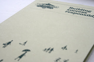
For a Warburtons promotion, a single spot colour which makes use of monotone imagery and text, I really liked the illustrative style and usage of a limited colour pallet.


A plastic piece which when layered with its card couterpart became visible, I liked the tactility of this.


Reflective stock and de-bossed text on a leaflet for a design company in Nottingham (above). (Below) I really liked this full colour publication, some tasty graph paper and a lovely crisp matte stock. I also like the printed sleeve.


Some printed text which has given a de-bossed impression on the surface of an annual report, making it that little less boring and lovely to run your nails over (above). And below a lovely logo as part of a University of Huddersfield booklet, printed in a nice metallic ink.


White on white. Mmm.


No comments:
Post a Comment